An inclusive and modern rebranding to inspire the next generation of women sport fans.


GO is a women sports streaming platform for whom Radiate Online made a visual rebranding considering clients preferences, contemporary standards and marketing goals.
The rebranding process included competitor and target audience analysis, defining brand verbal core and creating graphic assets with mockups and guidelines for them.

As a part of a visual design course by Created Academy, GO was a streaming platform with a goal to shine light upon women sports, which has been growing and advancing noticeably in past years.
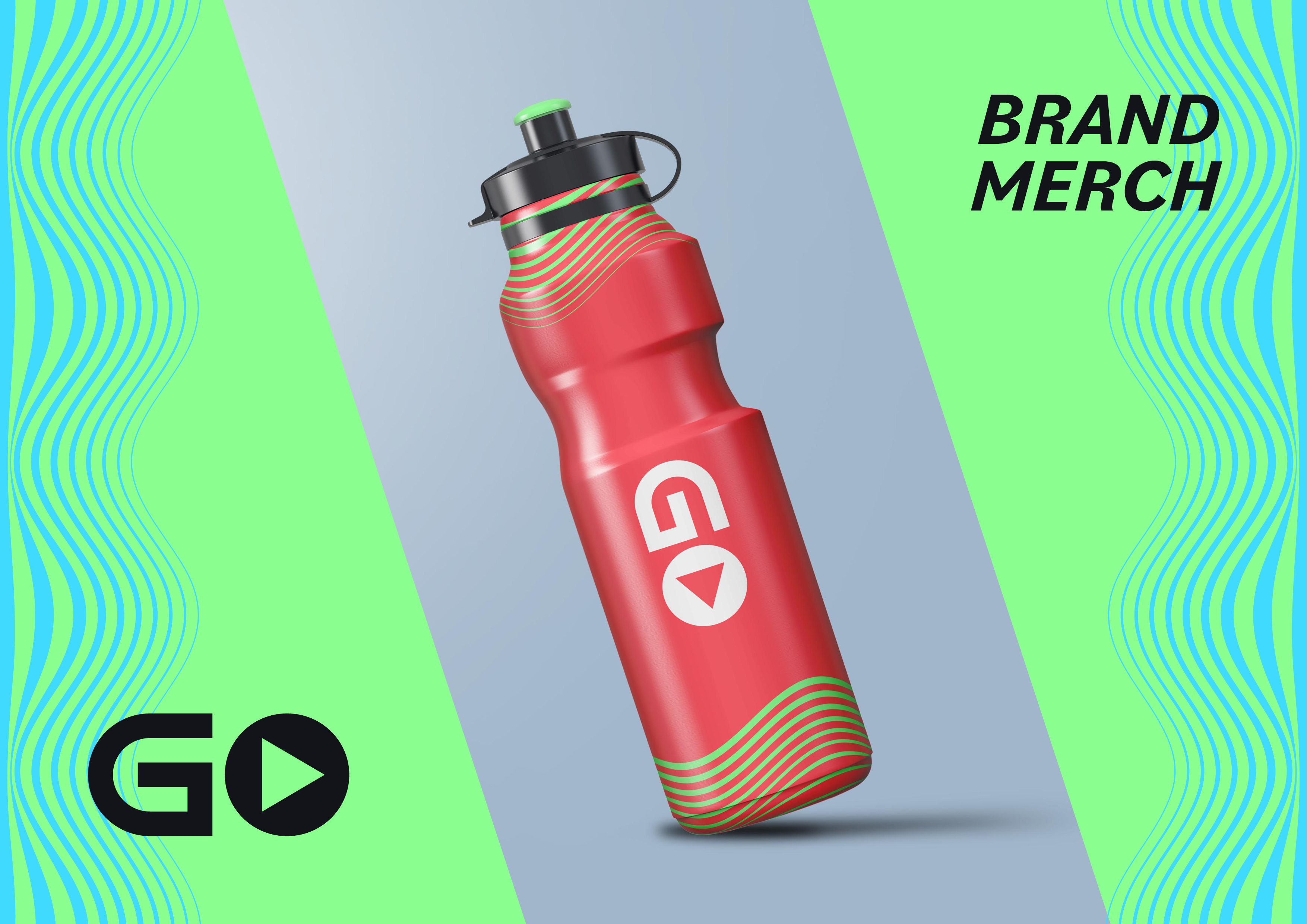
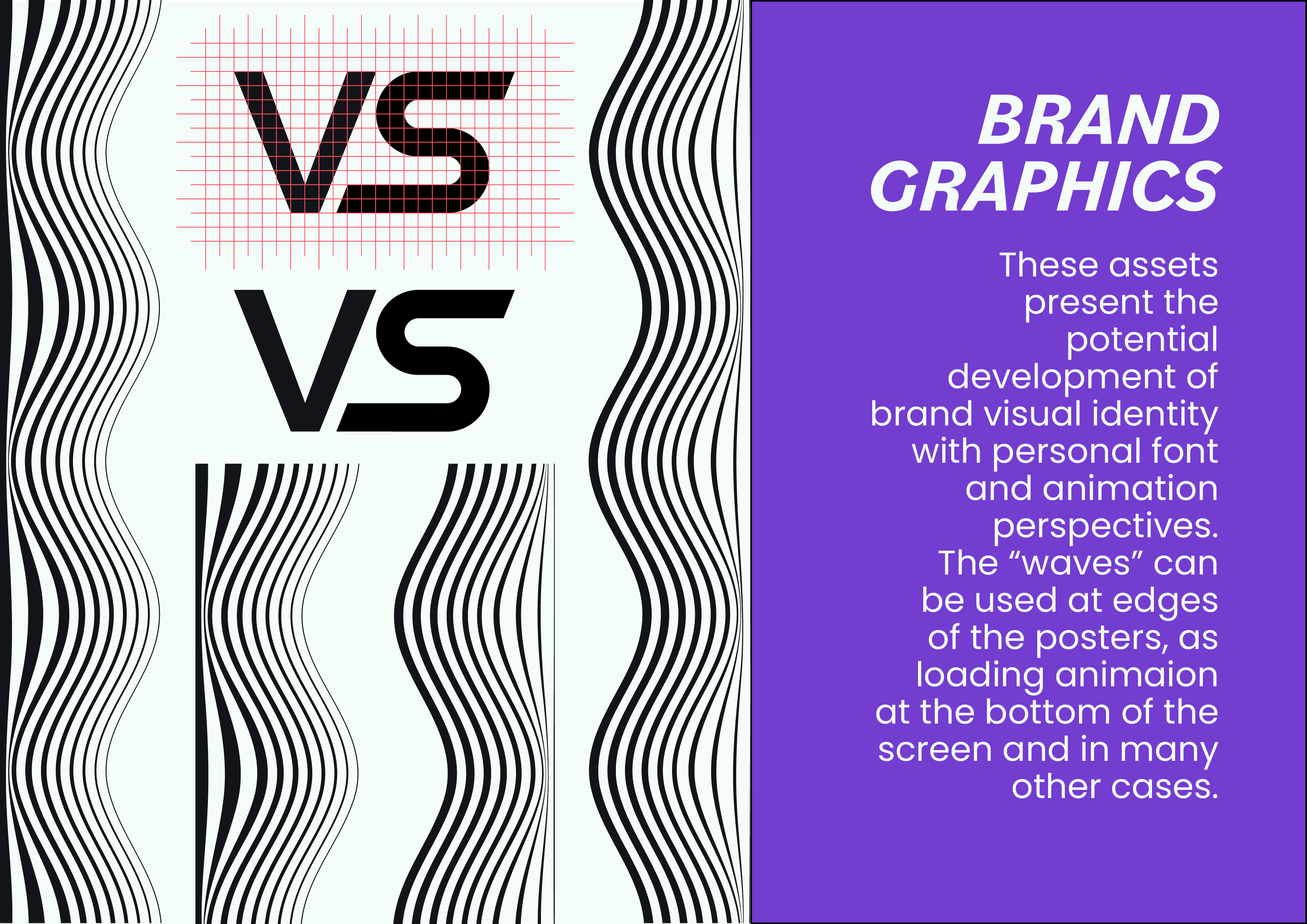
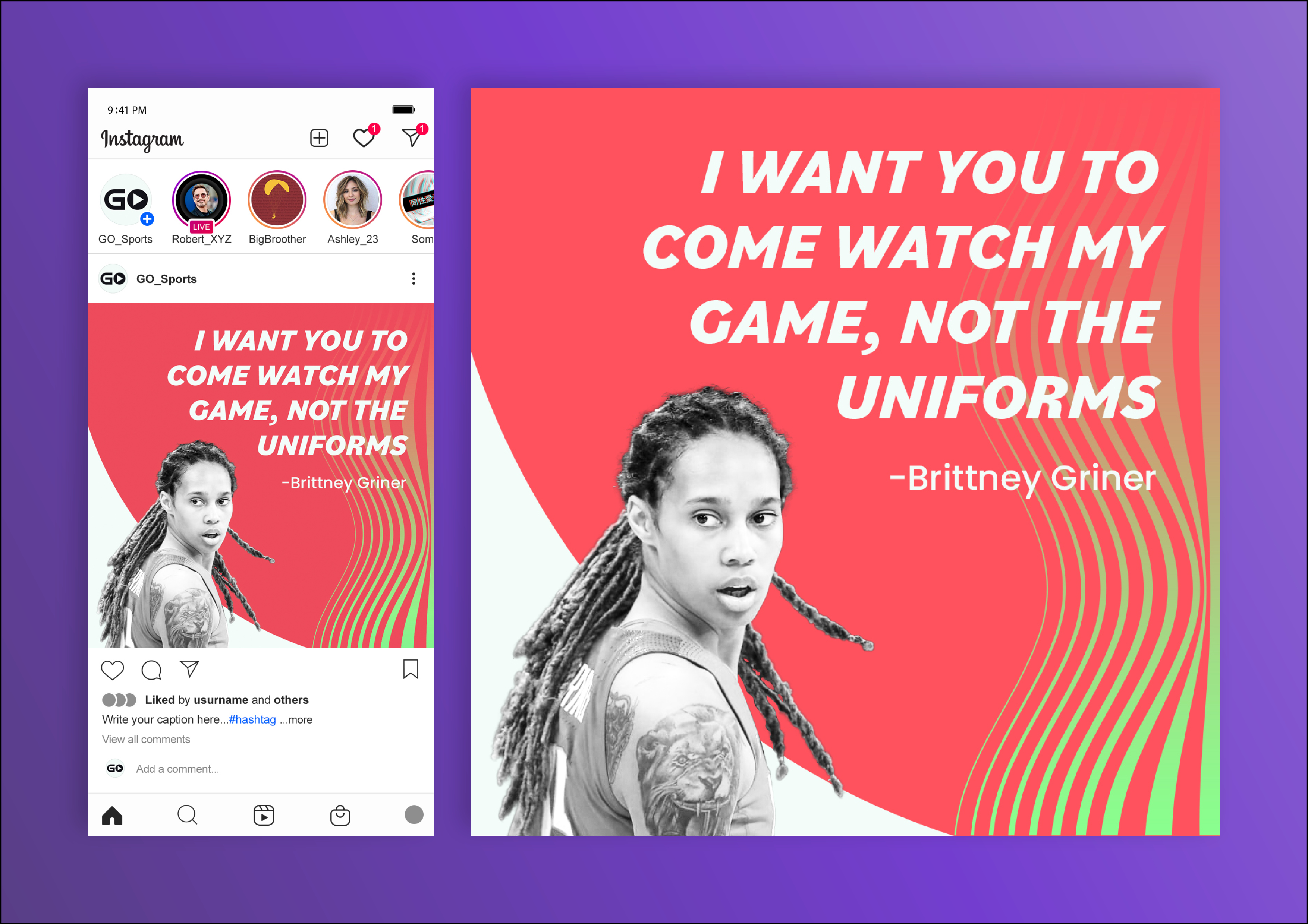
However, there was a need for redesign, which included redeveloping the whole of GO’s visual identity. There was a need to create a new logotype, chose typography pairing, determine a colour palette, develop graphic assets and present it to the client with clear and relevant annotation and guidelines, as well as mockups bringing all the pieces of the puzzle together.
There were few stages to this project: brief, research, ideation, development and delivery. The brief consisted of communication with the client to recognise all the nuances, understand the client’s perspective and define the problem Radiate Online had to solve.
Next, Radiate Online researched the field to decipher the audience and find a design niche, which competitors have overlooked. At the ideation stage, the brand was defined verbally, incorporating all the knowledge built in previous steps.
Finally, the necessary graphics were developed and delivered to the client, along with a detailed explanation of their advantages and guidelines, how to use those most effectively.
The client appreciated the rebrand, and together with Radiate Online, they moved to the development of a design system, which third-party developers can use to create a website and App considering all the branding attributes.
I appreciated the unconventionality of GO’s concept, so it was an engaging challenge to develop such a brand.
The degree of sole responsibility was higher than in other project I have done, which happened to be a stimulus to invest even more time and attention into creating the best visual solution there was.

