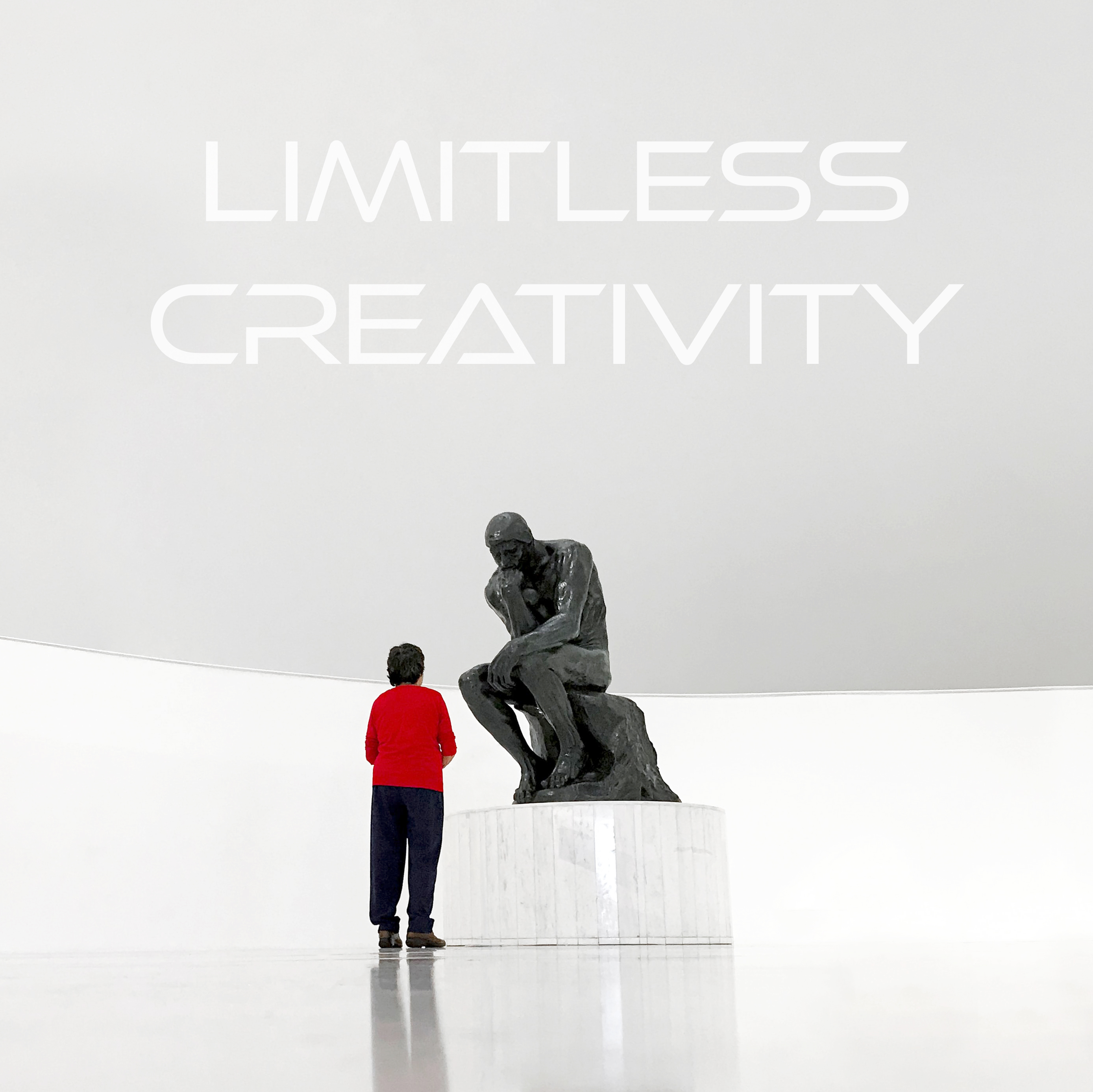
Establishing visual identity for a student society at Lancaster University. Branding designed to inspire.


IMS was a new society at Lancaster University. Particularly, society required a visual identity to draw students attention and build online presence.
The process included logotype ideation and Instagram posts development according to the latest esthetic trends and “golden rules”, students preferences and the message society wanted to convey.
Society already had a logotype and some other graphic features, but those were… simply not good. The team explained their vision: “The logo should speak, inspire by just looking at it! Also, we want to make it modern. Like Google or Apple stuff.”
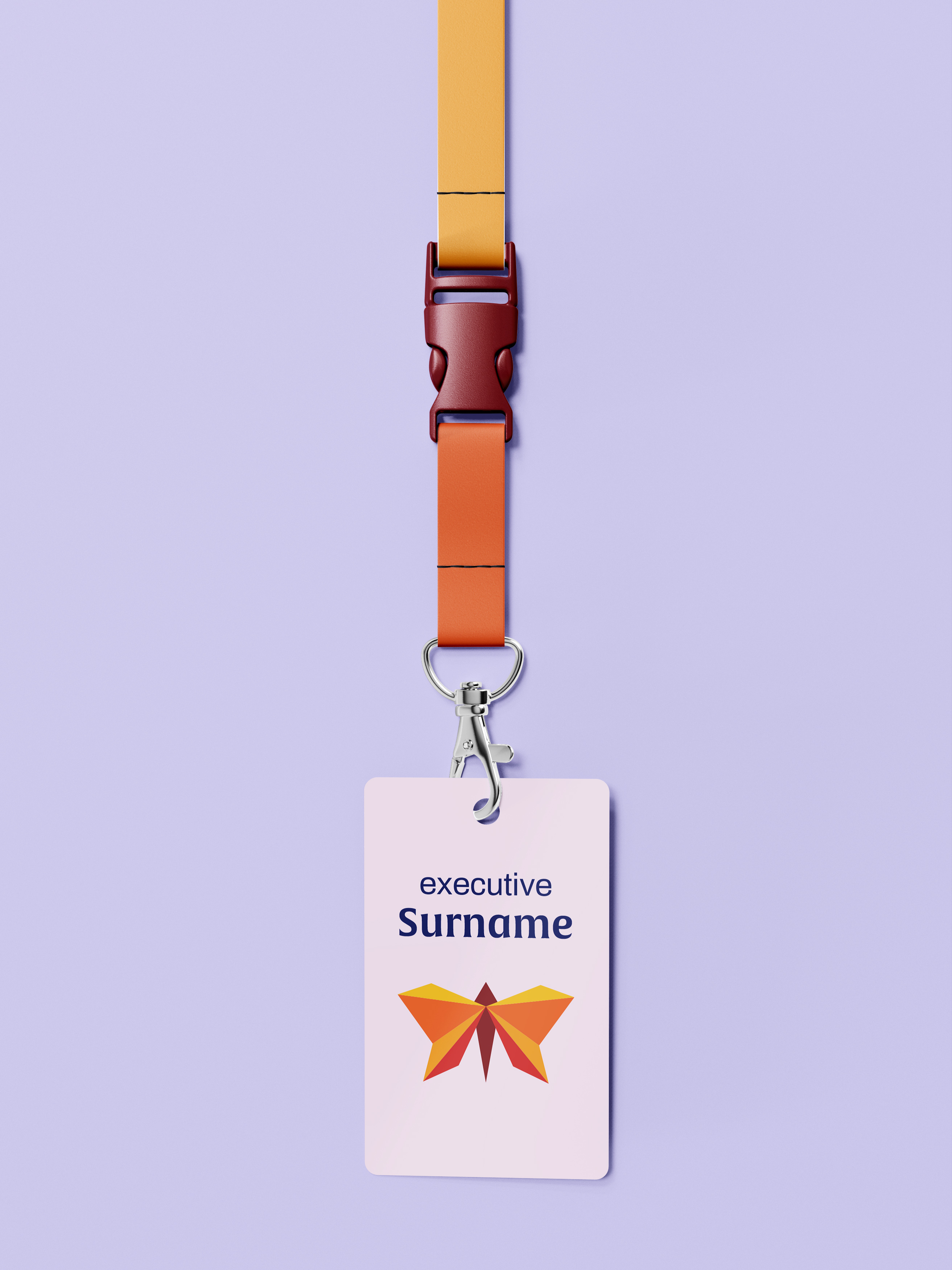
After hours of brainstorming, the suitable symbol was defined: butterfly, which can flutter and represent life, a symbol transducing the IMS mission. Next, the butterfly was stylised to the minimalistic form, joined with a sense-amplifying colour palette and font.
The team was impressed by the logotype, which was presented along with mockups, showing its use in a real-world setting. Then, IMS described what should their Instagram look like. To keep the consistency, the palette was applied to colour choice during development.
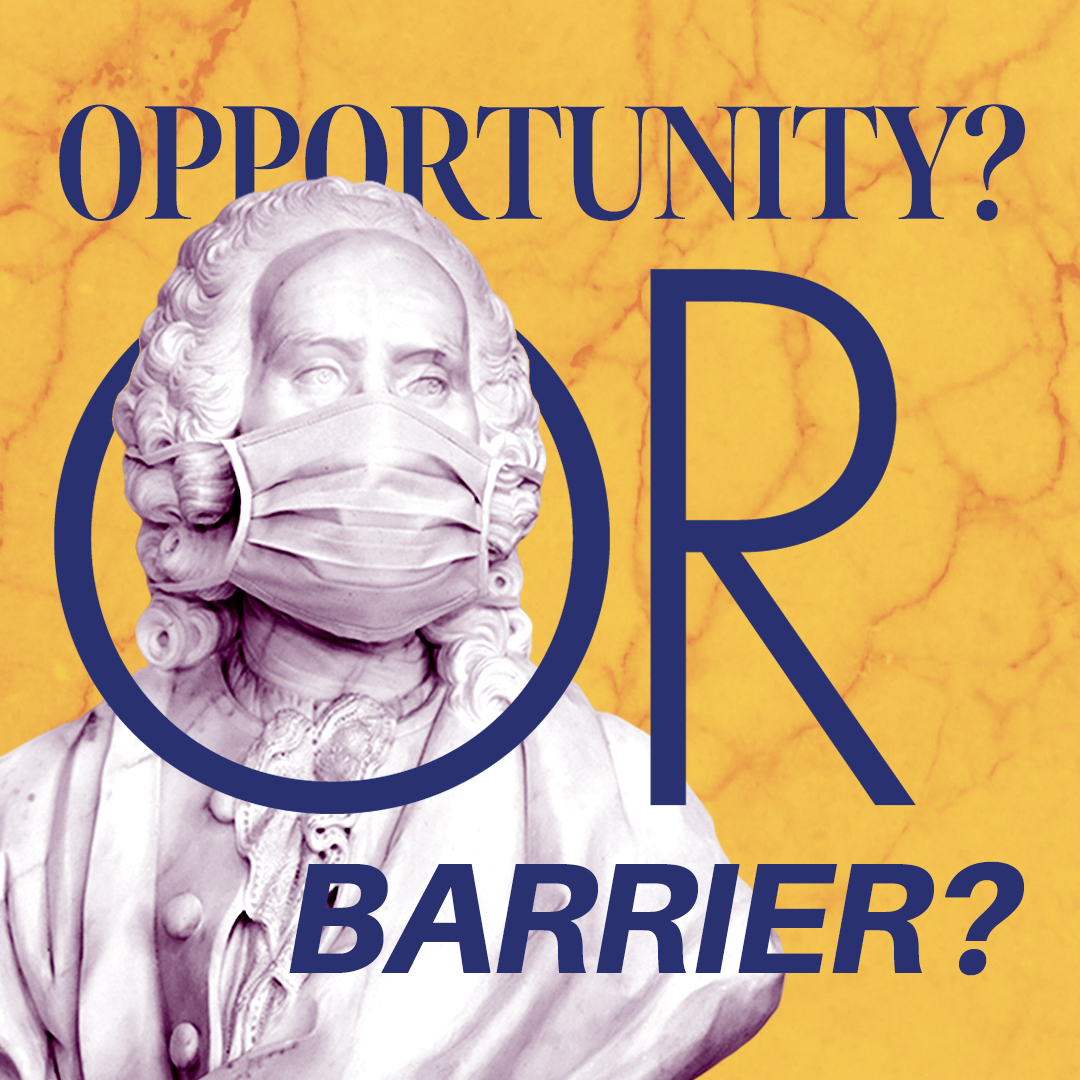
Finally, the product was delivered to the team in a package, including all the graphic assets in an abundant number of scales, formats and variations. IMS wanted to further work, but due to COVID-19, all university societies had experienced a huge involvement drop from the students ’side, so the further collaboration was postponed until the situation restabilises.